Screen Shot #7 (Merely a picture to illustrate that our GUI is totally
self-explanatory)
Tables are essentially files and variable and time can be
specified as outputs (without any internal TK-MIP headers). Standard
statistics can be invoked and compiled on appropriate sample functions and TK-MIP
includes capability to perform calculation of Spherical Error Probable (SEP)
and Circular Error Probable (CEP) either at the standard probability of
0.50 or as possibly customized to a more stringent designated probability of
containment, as say at probability 0.90 (as occurs for NMD application).

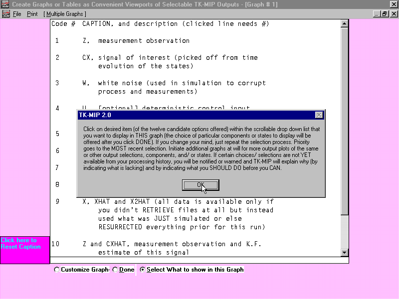
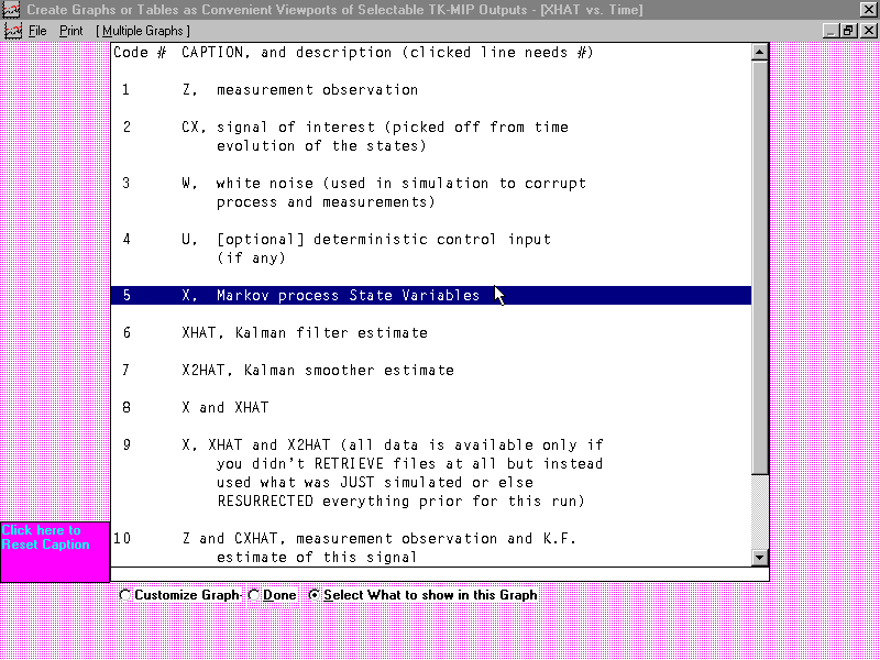
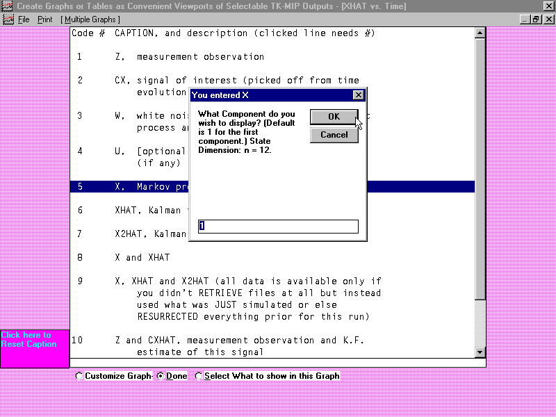
TK-MIP avails collections of coarser output plots (where an
illustrative example is offered below) that are quickly selectable (from
an automatically available standard menu or repertoire of reasonable outputs of
interest to analysts for comparison purposes) with application identifiers that
can be further customized by the user for conveying quick insight into the status of computed
results. These results may be cascaded or either horizontally or vertically tiled and
multiple plots may be displayed within a single graph as distinctly identified
by style of tick mark, plot style, and color.
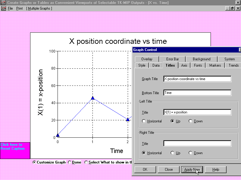
By clicking on the face of the corresponding graph with their
mouse, the USER causes the graph to fill out to full size, which
completely covers the background border (which is pink, as in the above example).
Each graph created in this way is assigned its own unique background border
color (which makes them easier to track and distinguish at a glance). If USER
later wants to rename graph titles, axis titles, change tick marks, connecting
graph colors, or styles, USER just clicks maximize button in upper right corner
for the graph of interest and the colored border is again exposed to offer
further customizing options (an operation that can be invoked and be performed
over and over again). After grouping and tiling multiple graphs via
juxtaposition in a way that best suits the USER’s
needs to “tell
a story”, the entire collection
can be printed out either one-at-a-time or en masse as a single snapshot using
the upper left Print.
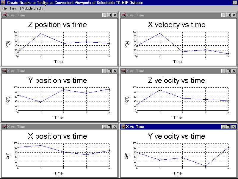
These coarse “no
frills” output plots (above) just connect the individually computed
output pairs depicted here above as “dots”,
as obtained at every designated discrete-time sample, to visually depict the
computed results graphically for the immediate benefit to the User, by quickly
availing any trends that a knowledgeable User may, perhaps, recognize and
understand right away as an immediate cross-check as a form of immediate USER gratification by availing fast
bare-bones results to appease the USER's curiosity. The other more sophisticated
plot packages, depicted earlier above, have all the standard computational
accoutrements (i.e., “bells
and whistles”), such as the option of invoking Bézier curves
so that all output curves are smooth (except where estimator outputs are
depicted as essentially instantaneous vertical jumps between two different
finite levels), representing processing results obtained both before and
immediately after a measurement sensor data update, as they specifically affect:
-
computed state estimator outputs,
-
the associated on-line computed covariances,
-
the associated computed errors in these outputs, as obtained
by directly comparing the available “true
state” to the computed estimated state.
Go to Top